In the vast realm of stock portfolio trackers, I embarked on a quest to find the perfect balance between functionality and aesthetics. Spoiler alert: my search was as fruitful as finding a unicorn in the stock market.
So, I rolled up my sleeves and took matters into my own hands, crafting a stock portfolio tracker that’s nothing short of a masterpiece. Today, I’m unveiling the crown jewel of my creation—the dashboard!
My mission with this dashboard? To make portfolio performance data not only comprehensible but also visually stunning. And guess what? I’ve got some invaluable lessons to share from this exhilarating journey:
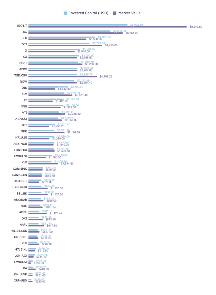
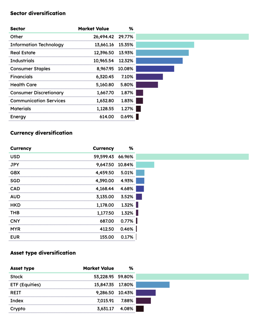
📈 Tip #1: Sort Your Bars and Pies Smartly
For bar and pie charts, it’s a cardinal rule—arrange your data from largest to smallest. Simplicity and clarity, always.
🏷️ Tip #2: Label That Data
Don’t leave your audience guessing. Data labels are your friends, guiding the way to enlightenment.
🚫 Tip #3: Eliminate Excess Axes
Ditch the x and y-axes when data labels already do the talking. Streamline your charts for a sleeker look.
🥧 Tip #4: Pie Charts? Proceed with Caution
While they may seem tempting, pie and donut charts can be space hogs. And when it comes to data labels, Google Sheets isn’t the most flexible buddy.
🎨 Tip #5: Get Creative with Colors
Gradient colors might be a no-go in Google Sheets, but I’ve got a workaround that’ll leave you impressed. Say hello to my SPARKLINE magic!
📷 Tip #6: Tackle Image Woes
Images in Sheets can be a bit unruly. As of writing this, here’s how images are gonna work in Sheets: the image imported last will be the top layer, so keep that in mind for your design endeavors.
Ready to dive in and explore the magic yourself? Head over to my Gumroad store, snag a copy of the sheet, and let the chart-topping adventure begin!
That’s a wrap, folks! I hope these tips add a splash of pizzazz to your charts and make your spreadsheets anything but ordinary. Got questions or thoughts? Share ’em below, and here’s to charting a course towards spreadsheet excellence!
That’s it folks, I hope you found these tips helpful. And if you have any questions or feedback, feel free to leave a comment below. Cheers to making awesome charts and never settling for boring spreadsheets!
Until next time,
Joshua
I hope you enjoy this tutorial as much as I enjoy writing it. If you’re into organizing your life, be sure to check out the ZestFi Stock Portfolio Tracker. Not your typical Google Sheet template, the ZestFi Stock Portfolio Tracker lets you easily track all your stocks even if you have multiple accounts, own different types of assets, and hold multiple currencies! This tracker makes use of the GOOGLEFINANCE API to fetch stock price updates and provides powerful analytics presented in a ultra clean dashboard, helping you make the best investment decisions. Say goodbye to the hassle of going back and forth between different apps and website to manage your investments, and say hello to ZestFi!
